 | ||||||||||||||
|
Tuesday, May 18, 2004
Blurgh. I've been working on a new layout for WIAN, and I'm rather ambivalent on one of the results. What do you guys think? Hideously ugly or tolerable?
The New The Old Priscilla said at 11:27 PM Comments:
OLD, GOOD: We know it, we love it. Loads fast. Plus, I have a fondness for blue and orange.
Post a Comment
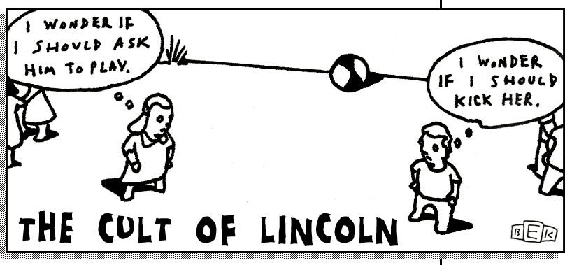
OLD, BAD: White on dark blue hurts. NEW, GOOD: Much easier on the eyes! Nicer graphically. NEW, BAD: The listing at top is a bit hard to read, because the text overlaps the bottom loop of the "A". May be hard on dial-up. OVERALL: I think the new version is just fine! I'm not completely keen on the lightish-blue-and-black scheme, but it's much easier to read through and browse. Title cartoon by Bruce Eric Kaplan, used without permission. |
| |||||||||||||

